Table of Contents:
- Pantone – what is it?
- Pantone colour of the year
- Very Peri – fashionable violet
- The colour of the year in practice
Pantone – what is it?
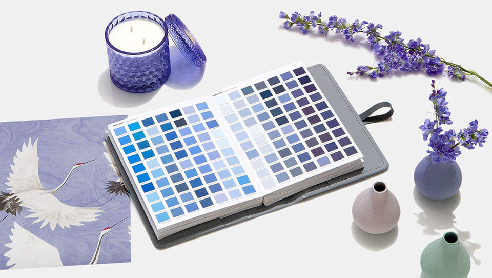
Established in 1963, the American consulting company Pantone specializes in the preparation of a standardized colour palette. It is used by designers, manufacturers and architects all over the world. It is the main product of the company. The company’s representatives established the Pantone Color Institute. Its task is to predict colour trends based on the analysis of current fashion and industry phenomena. It is responsible for the annual colour of the year announcements.
Pantone colour of the year
The Pantone Color Institute has been announcing the colour of the year for over twenty years. It first happened in 2000. Two colorus were named with this name twice. Most recently this was last year with two winners on the podium: Ultimate Gray and Illuminating.
The colour of the year is selected by an international body of colour specialists. They meet secretly twice a year for two days in one of the European capitals. It is during these meetings that the winning colour is established. This colour should, in principle, dominate the upcoming trends in fashion, printing and interior design.
Very Peri – fashionable violet
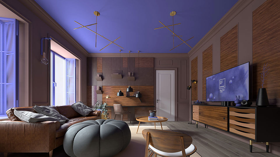
This time Very Peri became the colour of the year. It is a variation on the theme of violet with a blend of blue and red, resembling the colour of a periwinkle. For the first time in the history of the plebiscite, the winning colour was not previously present in the company’s catalog and was designed by the Pantone from scratch.
According to Pantone representatives, it symbolizes the spirit of our times. It is an emanation of the transformation that the world is currently experiencing.
We live in a time of change. PANTONE 17-3938 Very Peri is a symbol of the global spirit of the times and the change we are experiencing – Pantone informs in its announcement. As we come out of a difficult period of isolation, our beliefs and standards change and our physical and digital lives have come together in new ways. Digital design helps us cross the boundaries of reality, opening the door to a dynamic virtual world where we can discover and create new colour possibilities. Along with gaming trends, the expanding popularity of metavers, and the growing artistic community in the digital space, PANTONE 17-3938 Very Peri illustrates the fusion of modern life and how colour trends in the digital world are manifested in the physical world and vice versa.
The colour of the year in practice
Whether the colour of the year forecast by the Pantone is actually reflected in trends in fashion, printing, design or interior architecture depends on whether architects and designers themselves decide to use it. Not all previous winning colours turned out to be as popular as expected.
However, if the predictions are confirmed, and Very Peri actually gains popularity, then many interior design elements in this colour will go to fashionable homes. These can be, among others, window decorations – curtains, blinds or small decorations. They will match very well with, for example, Woodec series window veneers. They are distinguished by a visible wood structure, which clearly resembles the natural grain. These are Turner Oak, Alpine and Concrete designs. The bright Turner Oak has a caramel colour scheme. Alpine has a cooler tone that fits perfectly with the Scandinavian style. Concrete, on the other hand, impresses with the colour of wood thrown from the sea, which fits perfectly with modern construction.

