Pantone chose two colours
Pantone Color Institute is a global colour specialist. Specialists of the institute every year invite a team of experts engaged in colour standardization, to choose the dominant colour at secret meetings. This year, there are two winners on the podium: gray Ultimate Gray and yellow Illuminating. The choice seems to be justified by the coronavirus pandemic, which has become the number one topic and dominated all areas of life. Subdued gray shows what a difficult situation we have to face. On the other hand, it is reminiscent of silent rocks and stones that symbolize eternity, strength and power. Yellow, on the other hand, is the colour of hope, energy and optimism, because the sun always comes out after a storm.
A matching duo
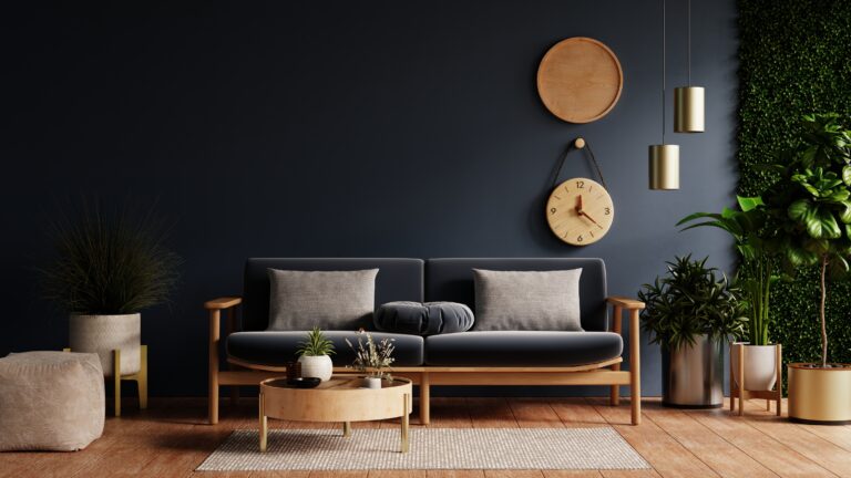
At first glance, it can be said that the colours chosen by the institute have nothing to do with each other. These are two distant and independent colours, but if we try to combine the two colours, it turns out that they look very attractive together. The colours complement each other perfectly and harmonize with each other. Certainly, this perfect duo will be present in our interiors very quickly and will be loved by the world of design.
Windows in shades of gray
Being suggested this year’s choice of the institute, we can follow the trends and choose the colour of the window joinery in a fashionable way. In our range of nearly 40 PVC veneers you will find the colour Gray – very similar to the colour chosen by Pantone. Greyness is appreciated mainly for its neutrality, as its final character depends on other pieces of equipment. Thus, the windows with the Gray veneer will suit almost all types of facades and interior arrangements. If you want to completely submit to the colour trends set by the Pantone Color Institute, we offer to compose a set of PVC windows with Gray veneer and mSun facade blinds with yellow lamellas. It is quite a bold combination, but the world belongs to the brave. Be inspired, seek interesting solutions and enjoy a rich colour palette.


